Why?
I wanted to compare the differences in body types between sports, so that people might be able to find sports that better suit their body types. For this reason, I looked for a dataset that had data about athletes’ bodies and what sport they played.
The dataset I used met my requirements because it has data about BMI, height, sex, and sport played of multiple athletes. It also has other useful biometric data, like lean body mass and body fat percentage.
Initial Analysis
For a first pass of analysis, I created a scatterplot of the average heights and BMIs of each sport. I grouped the data by sport and sex of the athlete to distinguish male and female sports.
I grouped by sport and sex rather than just sport due to sports that only had athletes of one sex (Gym and Netball for female, Water Polo for male).
#Import dataset and packages
df <- read.csv("ais.csv")
library("dplyr")
library("ggplot2")

#Data cleaning
head(df) #Just a quick check of the structure of the data
sum(is.na(df)) #This dataset has no NAs

#Data prep
df_by_sport <- df %>% group_by(sport, sex) %>% summarise(bmi = mean(bmi), height = mean(ht))
df_by_sport$sport_name <- paste(df_by_sport$sport,df_by_sport$sex,sep="_")

#Data visualization
ggplot(df_by_sport, aes(x=bmi, y=height, color = sex)) + geom_point()
Code Output
> sum(is.na(df)) #This dataset has no NAs
[1] 0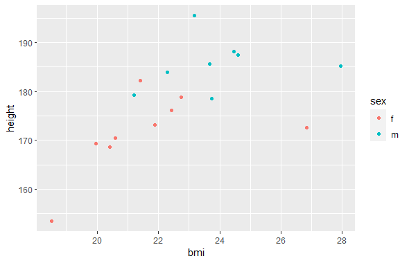
Data Exploration
Diet and exercise can change someone’s fat and muscle, but not their skeleton. Because of that, I wanted to explore the different variables I had to find the best estimate I could find for someone’s skeleton. Height gives the length of the skeleton, but I needed something for the width of the skeleton.
#Factors to explore: height, weight, bmi, percent body fat, lean body mass, sex, sport
#End goal is to see which sports fit are most common for each frame (skeletal height and width)
#ht (height) gives skeletal height, but I need an estimate for skeletal width
#factors I'll consider are weight, bmi, percent body fat, and lean body mass
cor(df$ht, df$wt)
cor(df$ht, df$bmi)
cor(df$ht, df$pcBfat)
cor(df$ht, df$lbm)
Code Output
> cor(df$ht, df$wt)
[1] 0.7809321
> cor(df$ht, df$bmi)
[1] 0.3370972
> cor(df$ht, df$pcBfat)
[1] -0.1880217
> cor(df$ht, df$lbm)
[1] 0.8021192
Data Cleaning
For my skeletal frame width estimate, I decided to go with an adjusted version of BMI that excludes body fat. This isn’t a perfect estimate, as it still includes muscle mass, but it should still bring me closer to my target.
#I think that trying to get the bmi of lean body mass alone is the best way to estimate skeletal width
#Two equations could potentially give this: bmi * (1-pcBfat), lmb/ht^2
df_mutated <- df %>% mutate(lbm_ht = lbm/(ht^2)) %>% mutate(bmi_pcBfat = bmi * (1-(pcBfat/100)))
cor(df_mutated$ht, df_mutated$bmi_pcBfat)
cor(df_mutated$ht, df_mutated$lbm_ht)
ggplot(df_mutated, aes(x=lbm_ht, y=ht, color = sex)) +
geom_point()
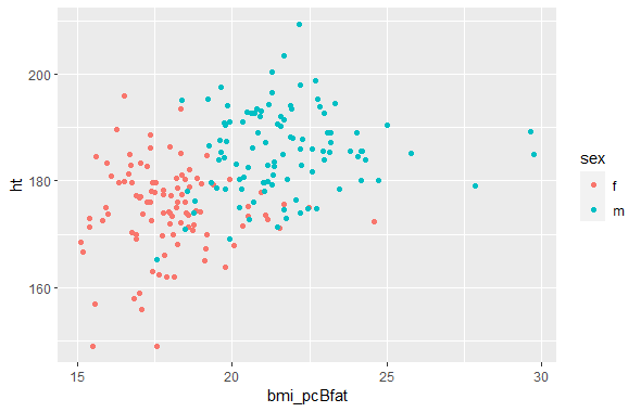
ggplot(df_mutated, aes(x=bmi_pcBfat, y=ht, color = sex)) +
geom_point()Code Output
> cor(df_mutated$ht, df_mutated$bmi_pcBfat)
[1] 0.4341629
> cor(df_mutated$ht, df_mutated$lbm_ht)
[1] 0.4352574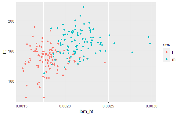
Further Data Processing and Visualization
Given that both equations were trying to find the same thing, they should end up producing the same scatterplot, and they do. Because I have no reason to prioritize one output over the other, I decided to average the two for my final analysis.
To check my new variable, I decided to check the correlation with height. I decided to split this out by sex, due to men having lower body fat percentages and higher heights than women, meaning that there’s two distinct clusters of data in my dataset of men and women. The correlation of my new variable with height was lower than BMI’s correlation with height, which is a good sign that I was able to create a variable that measured frame width adjusted for height more accurately than BMI.
#These charts look nearly identical, which is a good sign
#I have no reason to prefer one or the other, so I'll create a new variable that is the average of both
df_mutated <- df_mutated %>% mutate(lbm_per_height = (lbm_ht + bmi_pcBfat)/2)

#Correlations are actually higher than BMI, but after looking at the charts I notice distinct male and female clusters
#Males are taller and have lower percent body fat, so their cluster is offset above and to the right of the female cluster, causing our correlation
#To account for this, I'll check the correlation of males and females separately
df_mutated %>% group_by(sex) %>% summarise(correlation = cor(ht, lbm_per_height))
df_mutated %>% group_by(sex) %>% summarise(correlation = cor(ht, bmi))
#Our new variable has a lower correlation with height than bmi does, which is a good sign

#I'll repeat our analysis from the start with the new variable
df_by_sport_new <- df_mutated %>% group_by(sport, sex) %>% summarise(lbm_bmi = mean(lbm_per_height), height = mean(ht))
df_by_sport_new$sport_name <- paste(df_by_sport_new$sport,df_by_sport_new$sex,sep="_")

#Data visualization
ggplot(df_by_sport_new, aes(x=lbm_bmi, y=height, color = sex)) +
  geom_point() +
  geom_text(label = df_by_sport_new$sport_name, nudge_y = 1.5)
Code Output
> df_mutated %>% group_by(sex) %>% summarise(correlation = cor(ht, lbm_per_height))
# A tibble: 2 × 2
  sex   correlation
  <chr>       <dbl>
1 f         0.00263
2 m         0.120
> df_mutated %>% group_by(sex) %>% summarise(correlation = cor(ht, bmi))
# A tibble: 2 × 2
  sex   correlation
  <chr>       <dbl>
1 f           0.232
2 m           0.152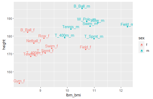
Final Thoughts
My final findings are:
- Basketball is the tallest, with a lean towards thinner frames
- Water Polo, Netball, Rowing, and Swimming lean toward taller and heavier frames
- Field has the heaviest frame, with no lean on height
- Tennis, 400m, and Sprint lean toward shorter and thinner frames
- Gym has very short and thin frames
I’m satisfied with my end results, since it satisfies my goal of finding how body types differ among different sports. One way my results could be improved is with a dataset that includes more sports and athletes, as this dataset only included 202 athletes across 10 sports.
